

Rebrand of the Monon Coffee Company, a small business with a 27 year legacy nestled in the Broad Ripple village of Indianapolis .
00

Inspired by a deep appreciation for preserving the local history. Nestled in the Broad Ripple village sits the Monon Coffee Company, brewing fresh coffee daily since 1997. This project gives them a professional, high-end identity that matches the quality of its legacy.
The strategy was centered on visual logic and historical anchoring. To move away from the confusing masterclass of the past (3 completely different logos), I looked to the origin of the name. The Monon Railroad (The Hoosier Line).
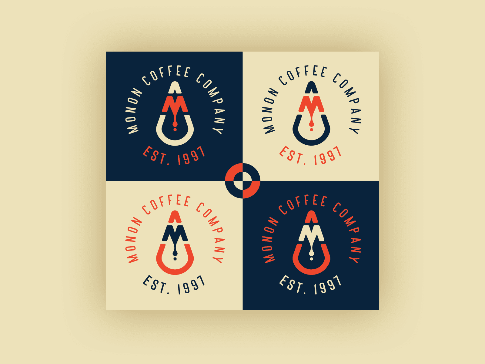
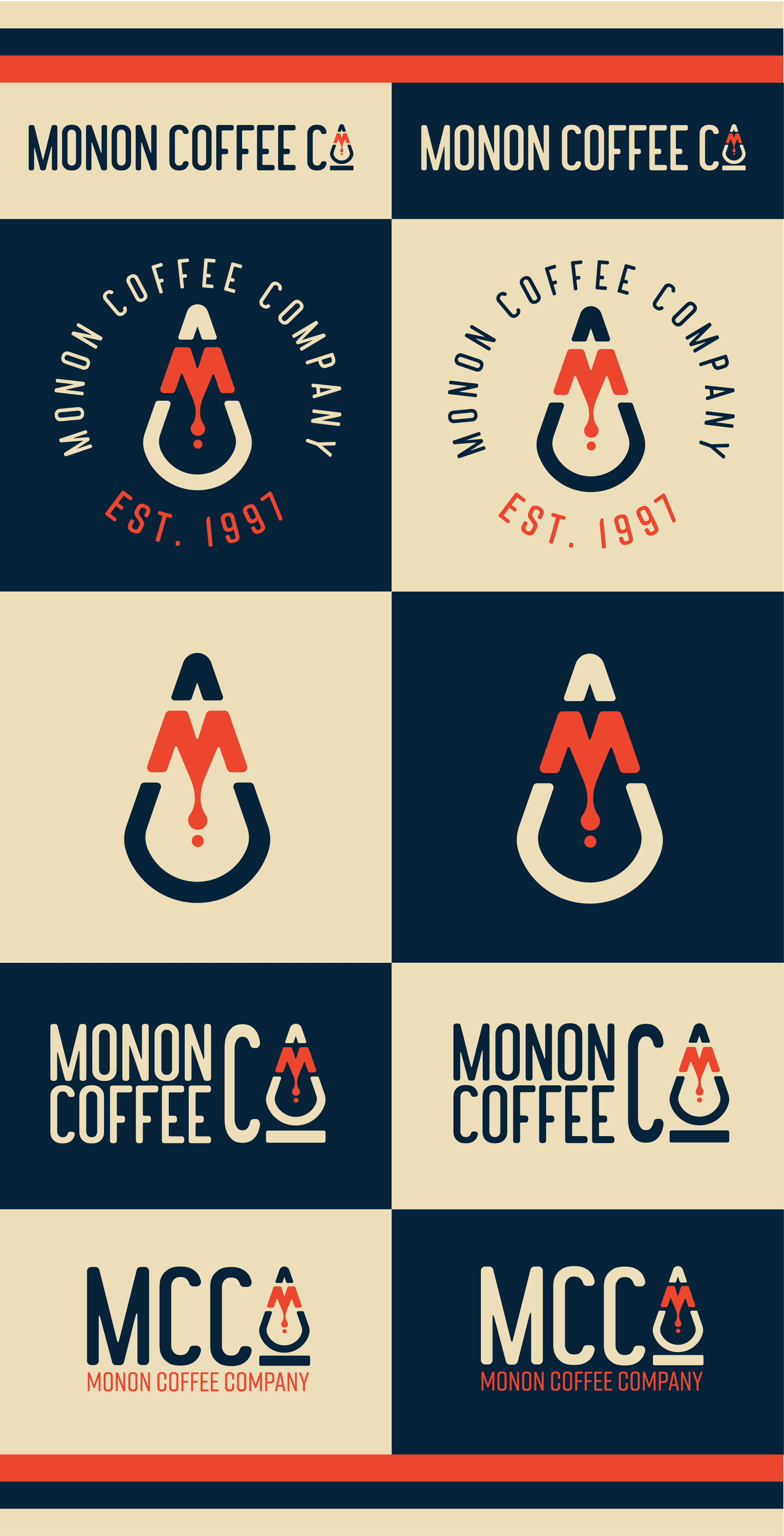
The Anchor: Utilize the iconic, mid-century "M" from the original Monon Railroad emblem to provide instant local soul and authenticity.
The Fusion: Marry the industrial hard lines of a locomotive with the soft organic nature of craft coffee.
The Silhouette: I used the cowcatcher(the inverted V-shaped plow of a train) as the primary containing shape to create a sturdy, forward-moving silhouette that works as a standalone icon, it also doubles as a similar shape as a drip.
year
2025
timeframe
24 Days
tools
Illustrator, Photoshop, Figma
category
Branding and Identity
problem
Monon Coffee Company is a Broad Ripple staple with nearly three decades of heritage, yet its visual identity suffered from a "triple identity crisis." The brand was operating with three distinct, non-cohesive logos across its physical and digital touchpoints: a text-heavy awning, a vintage train-badge window decal, and a disparate web logo. This fragmentation diluted brand equity and created a confusing user journey for customers moving from the Monon Trail to the storefront to the digital menu. The challenge was to consolidate 30 years of community vibe into a single, scalable mark that honored its locomotive roots.
solution
The final mark is a precision-engineered Drip-Engine monogram. The original Monon "M" was redrawn for modern legibility. A coffee drip was integrated into the negative space of the "M" symbolizing the extraction process. The entire mark is housed within the silhouette of a train's cowcatcher, creating an inverted "V" that doubles as a drip. A Heritage & Hearth palette, utilizing a deep Navy for industrial stability, a warm Terracotta for the "Red Zinger" energy of the shop, and a Cream base to keep the brand feeling artisanal rather than corporate.
see more projects

